
Blog
Welcome

Recent posts
SEARCH RESULTS FOR: Albums Design
I used to have a rule, 'If there is a black and white image in an opening the whole opening should be black and white!' It was a good rule because it fitted well with my 'Keep it simple' approach to album design. I have however seen some lovely designs from some very talented photographers where they are using the contrast between the black and white image and the colour one to either remind you of colour, or remind you of form. So I have modified my rule. Use colour and black and white together with intent only. Random meaningless mixing creates visual chaos and disturbs the viewing experience. To View More >>


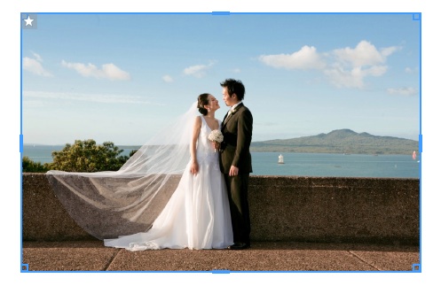
Meet one of Justine Ungaro's brand new client albums - a Mint green Queensberry Duo she shot and designed for clients Kristan and Steve. Justine met Steve while scouting for bands for her own wedding. He played in the band she eventually hired, and he booked her as his and Kristan's wedding photographer. Justine says, "We each had a real vested interest in the overall success of each other's weddings. It's been a pretty special relationship ever since." Kristan and Steve married on 30 May 2009 and when their album arrived, wrote to Justine to say... "We totally love this album! The photos look To View More >>
The White Bull - it's that empty page that stares at you intimidatingly - and most creative people have come across it more than they’d like. When I first started designing albums, I would sometimes sit at my computer staring at a blank layout or clicking and fussing, swapping this and that only to decide that the layout actually looked better the way it was! Creative energy needs to be used wisely, so if you agree that album design can be time consuming - and occasionally an absolute pain in the butt! - here's a little about Queensberry's design service, so you can get back to what you’re To View More >>
Version 1.47, builds on changes introduced in v1.46. Our main focus was on Queensberry's new press books, including fixes to the new workflow, many of them "behind the scenes" from the user point of view. We know we have a way to go with this and the developers are continuing to work on cover design issues in particular. Having said that we've introduced three new features to speed up your album design. They're still a bit "v1.0", but we wrote them in consultation with Queensberry's design team, who live and die by productivity, and we wanted to get them to you early so you could take a look and To View More >>
The purpose of our recent survey was to get a better picture of how you're using the software, and the features most important to you. It turns out you use Photojunction to design albums for almost a hundred album suppliers that we don't even offer resources for - no wonder a third of you "always" use Remix DIY! It's also clear that unless you're one of Queensberry's clients you're most likely using PJ primarily to design and export page layouts. That's not so surprising. Getting past "page design" requires a lot of input from vendors, and unfortunately they're much less engaged with PJ than their To View More >>
Email: info@queensberry.com
Free Phone Numbers:
New Zealand: 0800 905 905
Australia: 1800 146 251
USA: +18668350851
UK: 0800 808 5271
Canada: +1 855 581 0370